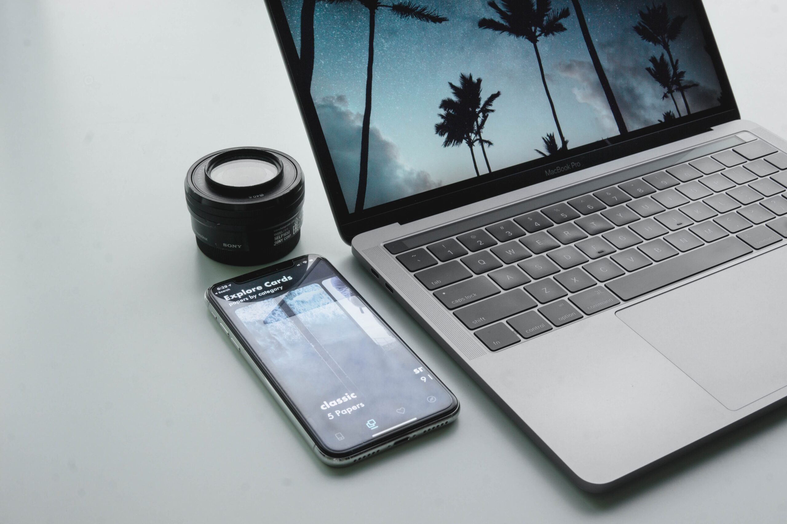
The last ranking factor that will become a major signal for the new Google update in 2021 is mobile-friendly design, AKA a responsive website. Yes, this has been an important ranking signal for a while now as it has slowly gone from something brand new 10+ years ago to something that is now expected on every website. In today’s world, if your website is not mobile-friendly, you will not rank on Google.
The single reason for this is that Google now uses a mobile-first view for a lot of websites to decide how the content on that website looks. It doesn’t analyze the desktop version anymore. So if your mobile version is broken, Google expects that your site is broken, thus you get penalized. The original deadline for all websites to switch to the mobile-only index was September 2020, but due to COVID, we’ve gotten a delay until March 2021.
If you or your web developer haven’t started redesigning your website and it’s not mobile-friendly by that date, expect to take a major hit in terms of rankings come April next year. (According to Google 70% of websites they’ve analyzed have already made the switch, but that means there are still 30% out there that aren’t ready for a mobile-first index.)

Mobilegeddon
This all started back in 2015 when Google released the update that most call mobilegeddon which gave a boost in the rankings to sites that were designed mobile-friendly. Then over the next few years the pendulum swung and the majority of online traffic switched from being majority desktop to majority mobile, with tablets still way behind either option.
In 2020, 51.53 percent of all global website traffic is on a mobile device. It passed the 50 percent mark in the beginning of 2017, according to Statista. What sort of things can you do to prepare or verify that you are ready for the mobile-first index?
- Make sure that you have robot meta tags for the mobile version.
- Checking images to make sure that they are compressed to the correct size and quality.
- Make sure that these images lazy load and that they have alt text
- Videos also have special markup and need to be placed like the images
- Make sure that all the primary content is similar on both desktop and mobile because if there is a major difference, Google will only see the changes on mobile devices.
- Double check all your pages on a mobile device or use something like an emulator (browserstack.com) to test your website on multiple difference browsers, screen sizes, and devices to make sure it works across the board.

Don’t Forget the Basics
Another thing to keep in mind is that just because your site is now mobile-indexed first, it doesn’t mean that you can forget about all the other on-page and off-page SEO that your site requires. You will still need to run a technical SEO-audit and focus on the content and keywords. It just means that most of it will be viewed through a mobile device lens rather than a desktop one.
You still need title tags and meta descriptions and copy with strong headlines. You need your structured data and all the things we’ve discussed in our previous SEO blogs (blog 1, blog 2, blog 3).
Pagination
One important thing that Search Engine Land points out when it comes to a mobile vs a desktop experience is the pagination of the content. Because on desktop we have a wider playing field, we can fit more content and copy on a page whereas on a mobile device it may get sent down. If on desktop you have pagination (numbered pages for different content that doesn’t fit on one page) but on mobile you use infinite loading, you may run into some major issues because infinite loading puts all the same content on one page rather than multiple pages like a paginated site does.
So make sure you look at your theme and the responsive settings for that sort of page so that it works the same and is paginated on all devices and screen sizes.
No Intrusive Interstitials
One last thing I want to cover is what Google refers to as intrusive interstitials or in your face annoying popups. GET RID OF THEM. They do a disservice to your users and only annoy them. If someone comes to your page to read some valuable piece of content or browse a product or service you offer, the last thing you want to do is stuff a popup offering them to join your newsletter or some other offer in their face within the first 5 seconds of arriving there.
I’m not saying all popups are annoying, but you can wait until they scroll 50-75% of the page or after 30 seconds of browsing before showing it. I even recommend having them triggered by buttons or exit intent before showing it on a timed basis. It interrupts the users ability to interact with your website and it does the same thing to Google’s crawlers. So it makes your site look a certain way to the crawler that will eventually tell Google how good your site is. If all the crawler sees is the text on the popup without it having the ability to see behind it, you have shot yourself in the foot.
Prepare for the 2021 Google SEO Update
So over the last few blog posts, we’ve tried to notify our readers of the upcoming Google change and we’ve notified every single one of our clients. So now that you know you still have a chance to make a difference with your own website and your own business. None of these changes are going live today. They will go live sometime in early 2021, and maybe get pushed back some more if COVID continues to dominate the news and society.
One good thing above all this is that good content will always do great if the page experience is great as well. So if you always focus on those two things you should be well off no matter what Google throws our way. At least for now.
Free SEO Audit!
Find Out How Your Website Ranks With Google and Improve Your Rank Today!


